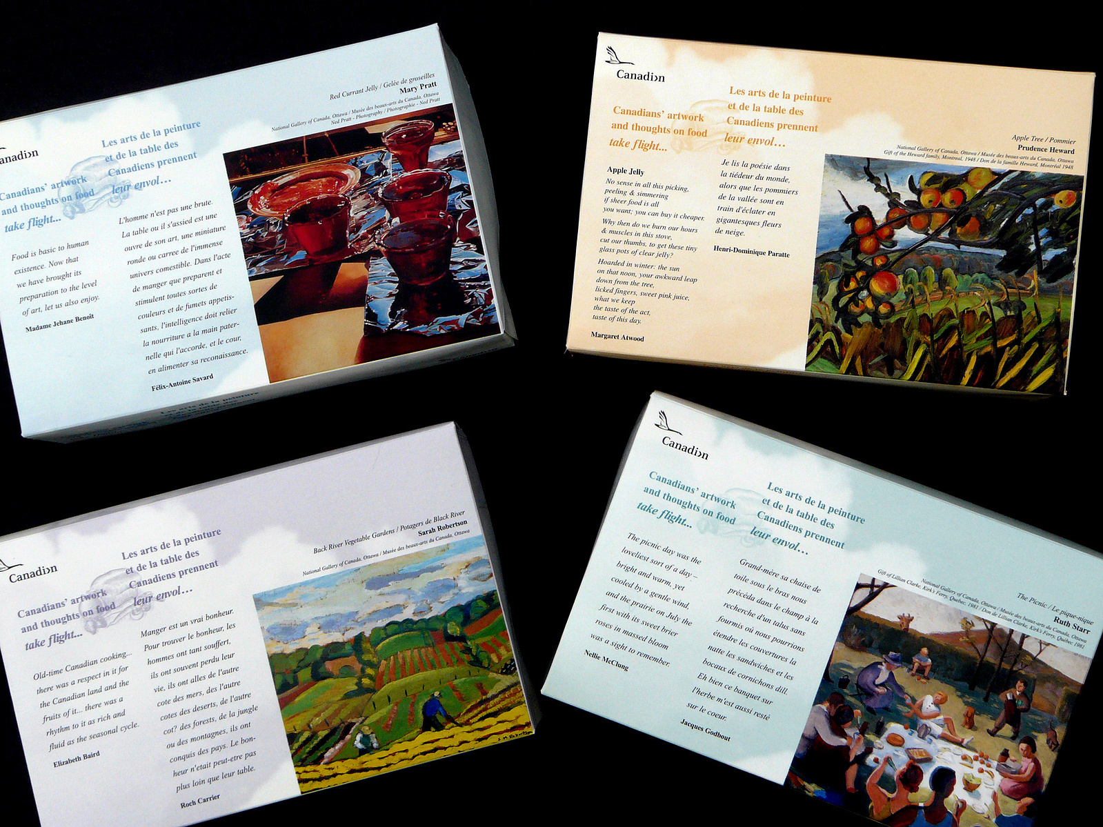
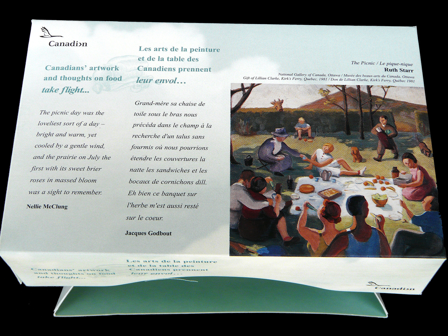
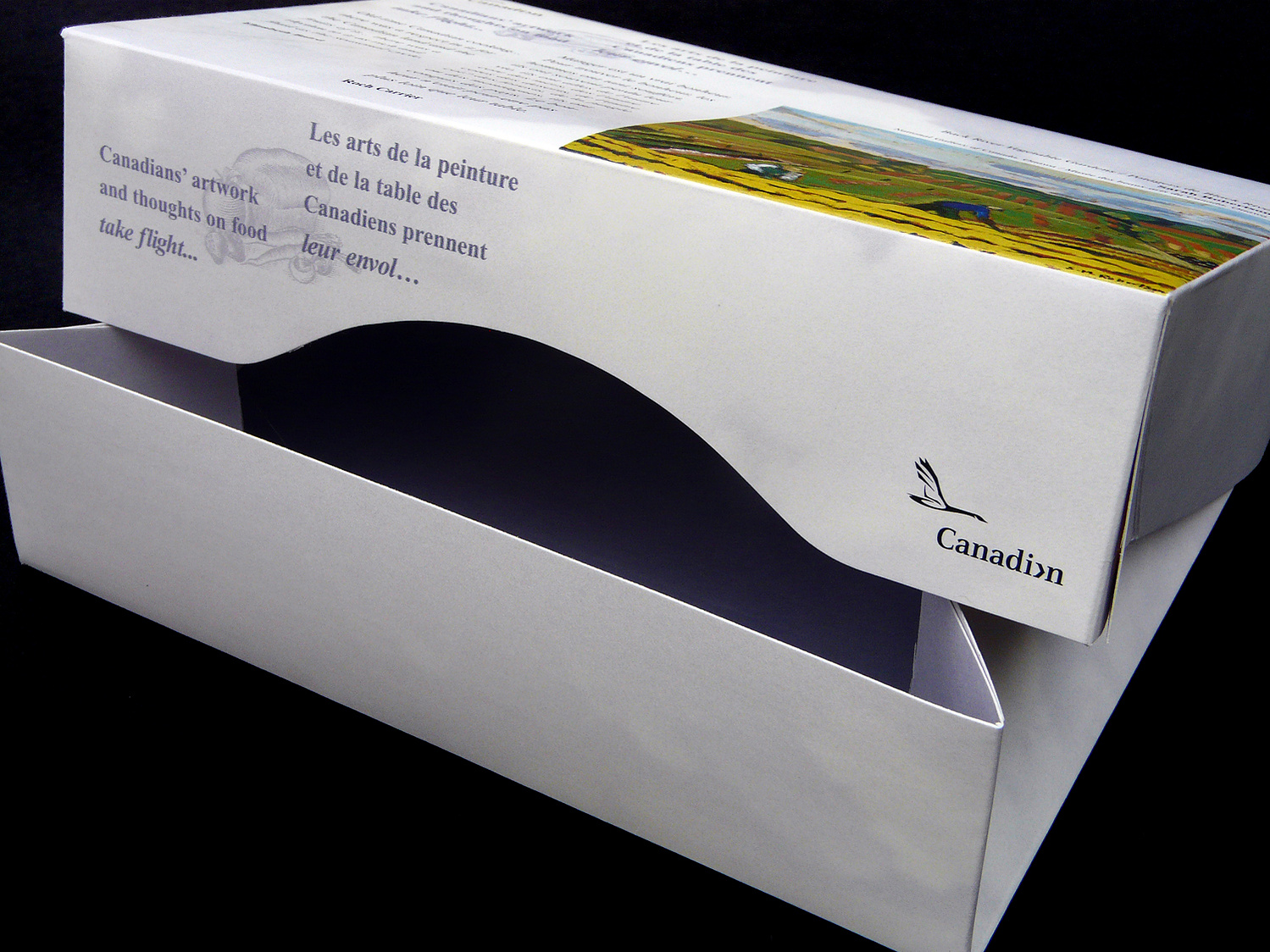
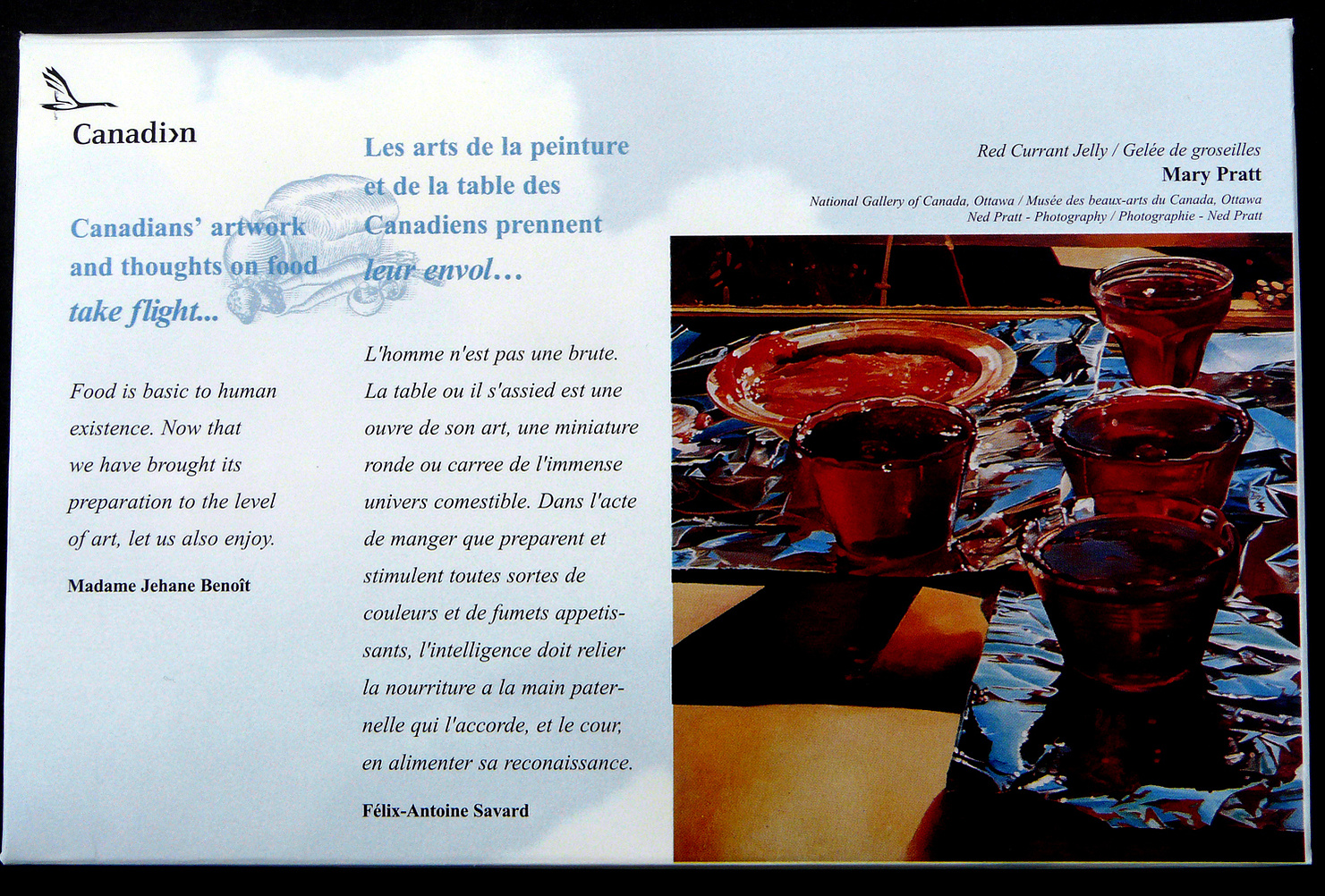
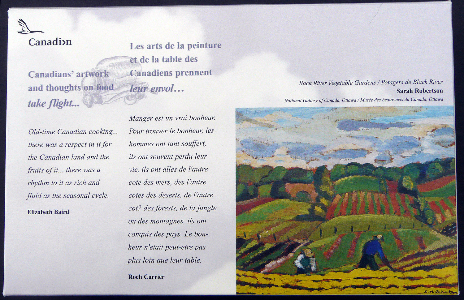
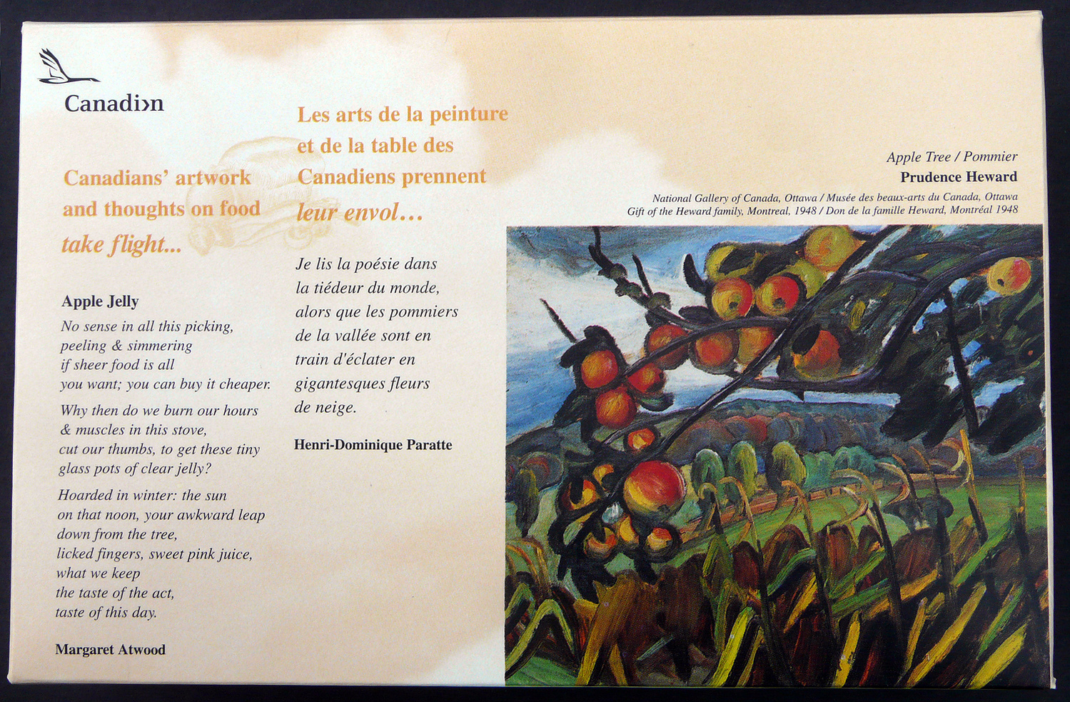
Client: Canadian Airlines
1998
Lunchboxes to serve during flights. My desire was to highlight Canadian art, writings and opinions on food as it felt appropriate to the company.
Rather than try to translate english into french and vice versa which I knew at best would be an inadequate approximation of the spirit of each writer, I opted to leave the prose in its native form. Brief bios of the highlighted creatives appear in both languages on the inside of the box.
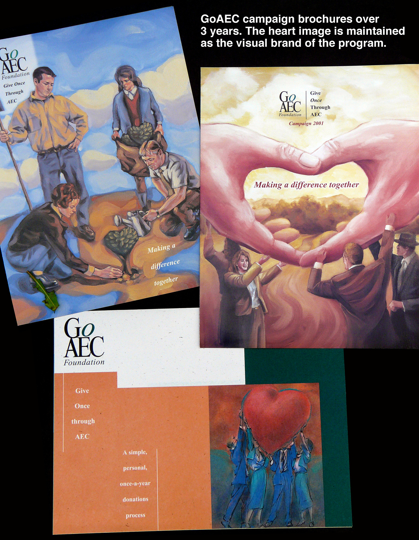
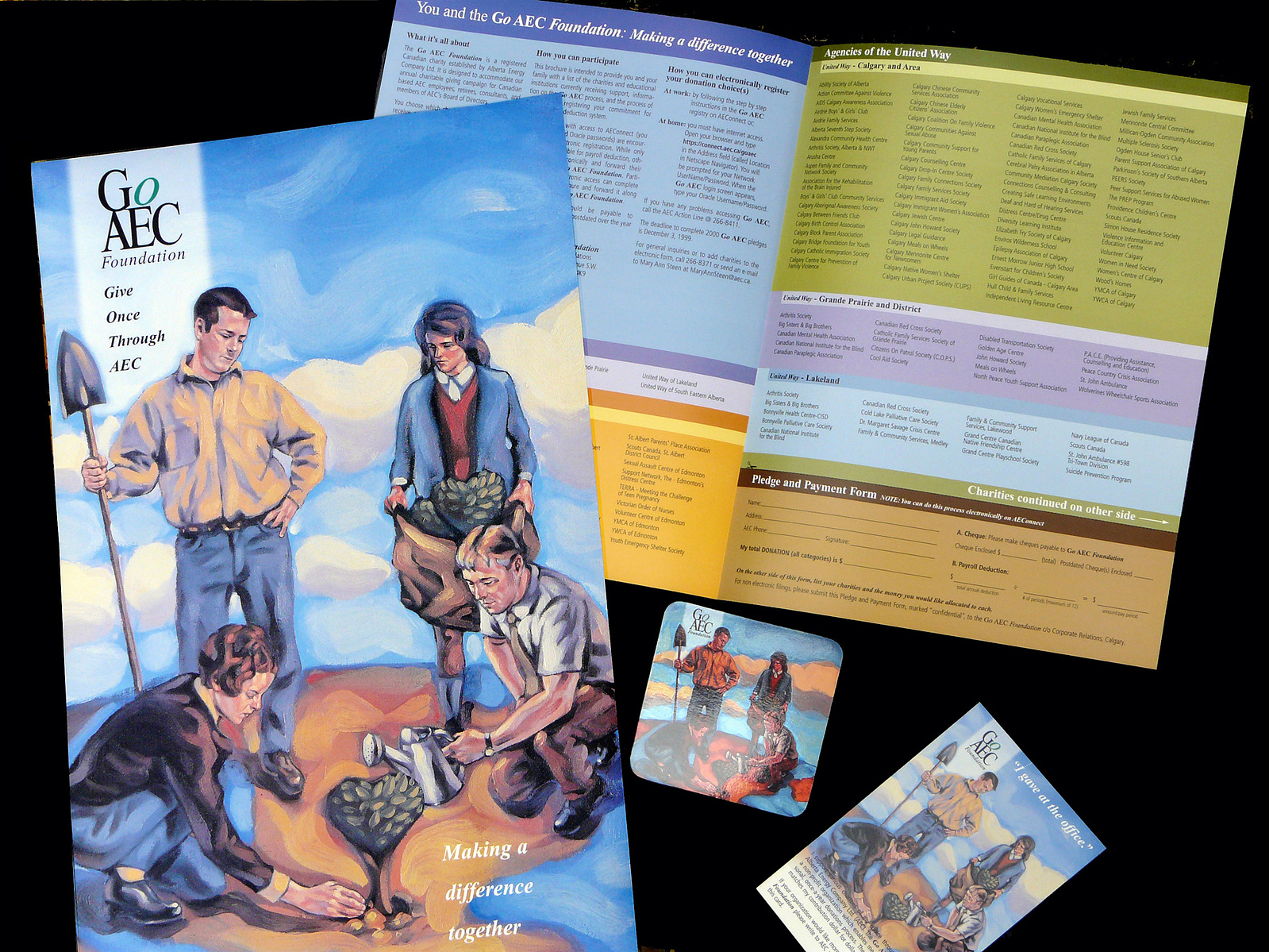
Client: Alberta Energy Company (AEC)
2000-2002
A yearly donations program where employee donations are matched dollar for dollar by the company.
Each campaign was launched internally with activities, give-aways and communications to inspire participation.
The branding image of the heart is the consistent theme as the commissioned artist would change from year to year and that was their one creative criteria.
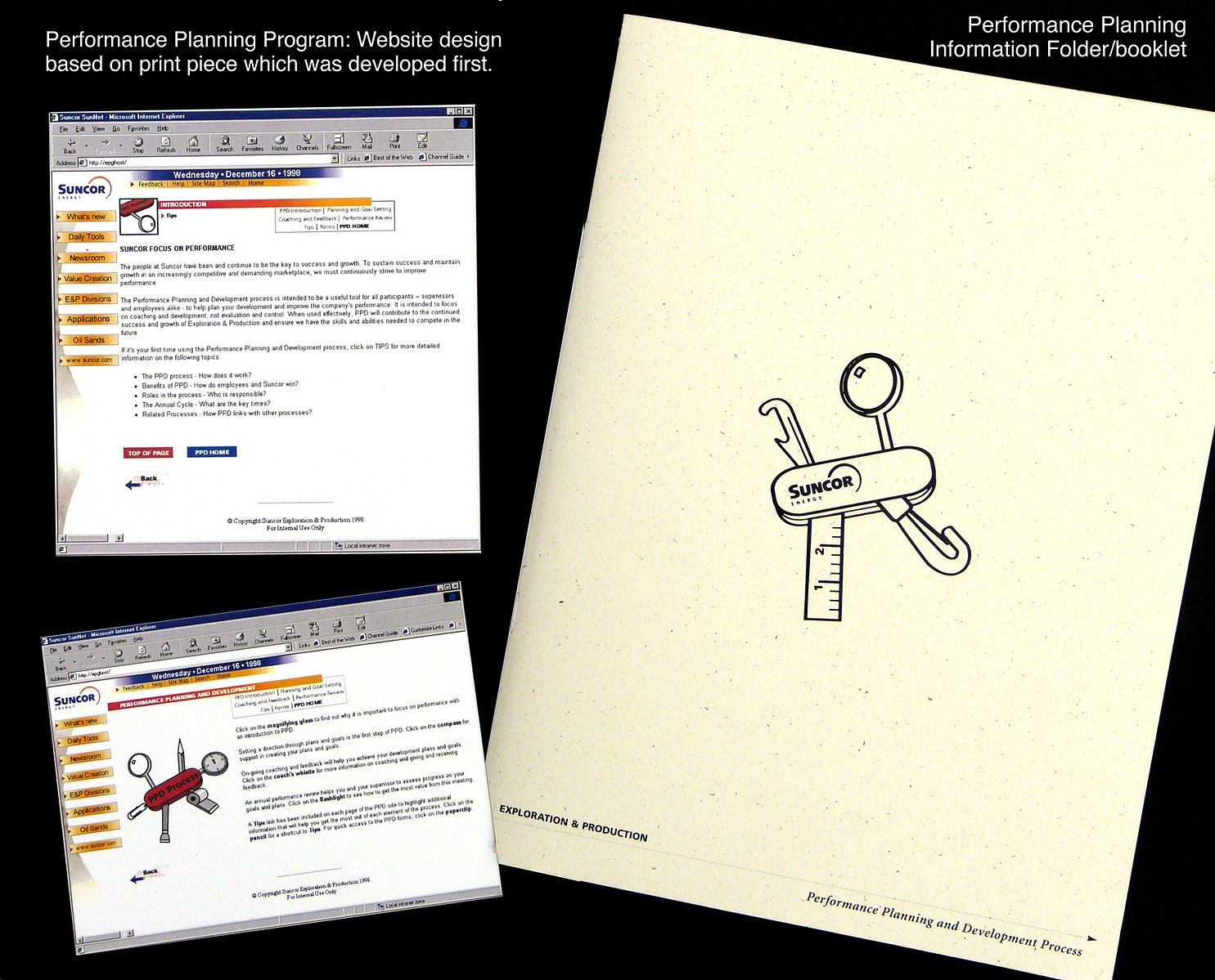
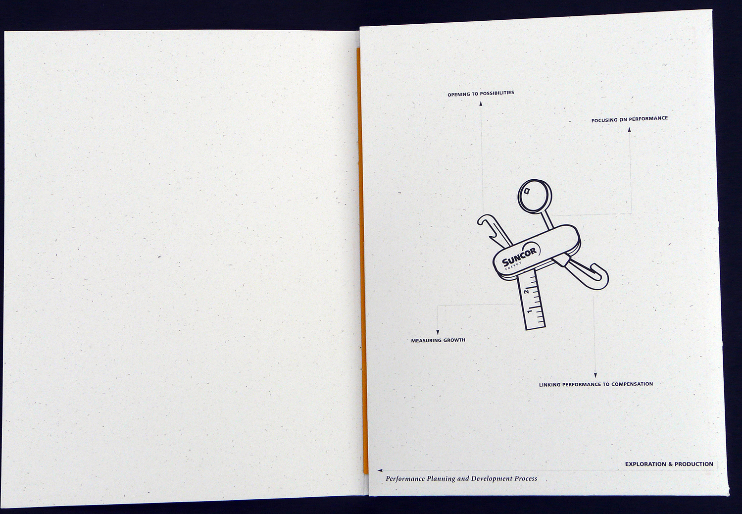
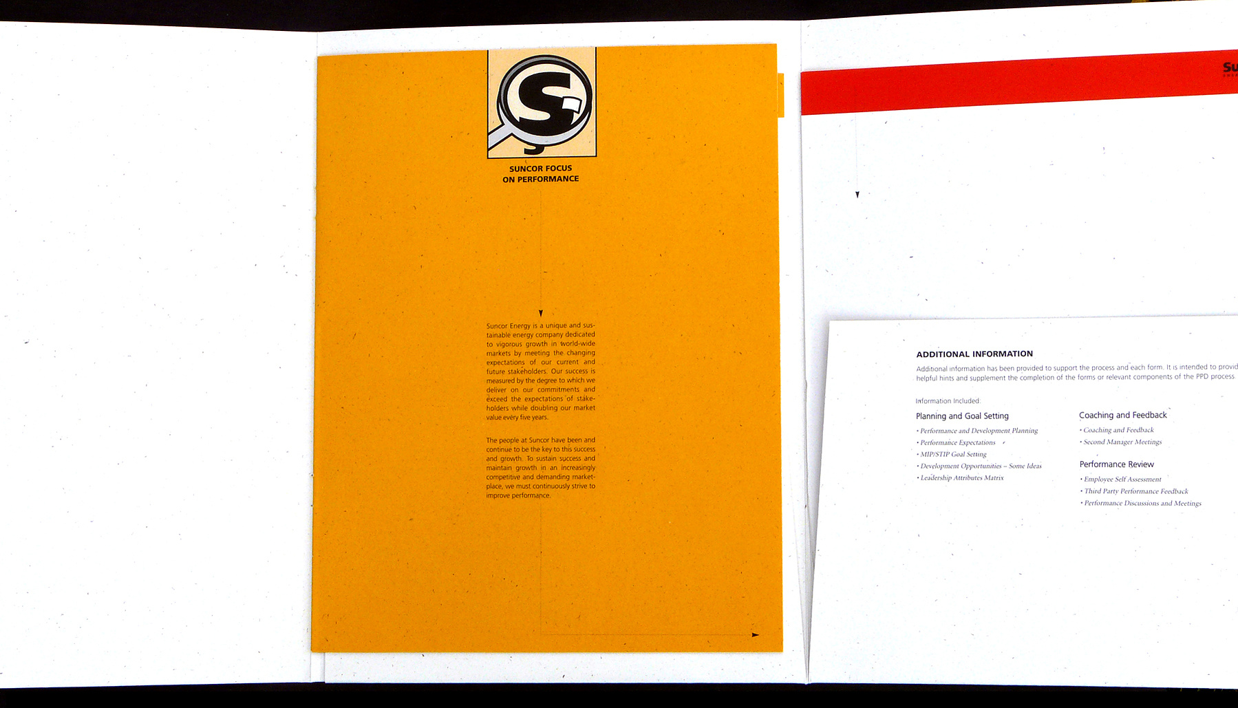
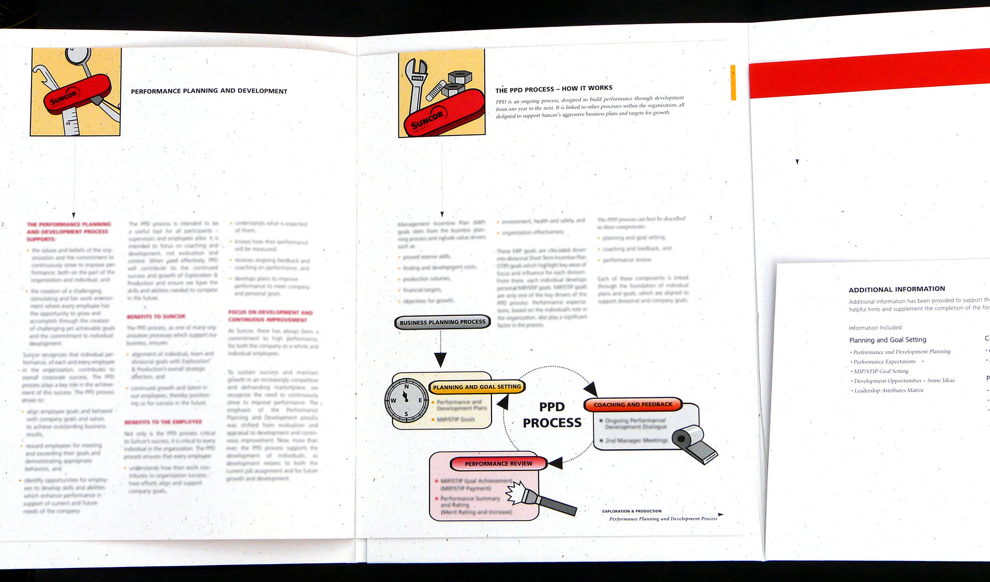
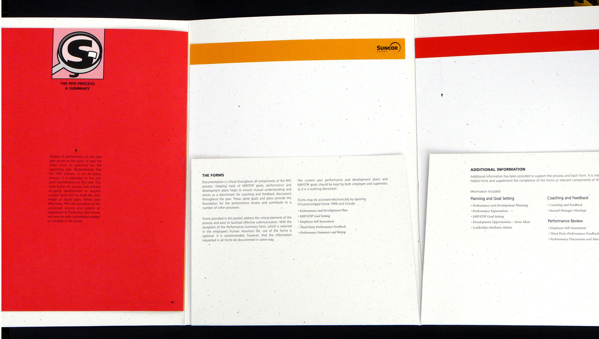
Client: Suncor Energy
1997
Printed information package on Human Resources information along with accompanying website.
The creative tool metaphor is the swiss army knife that has everything the employee needs to understand the process.
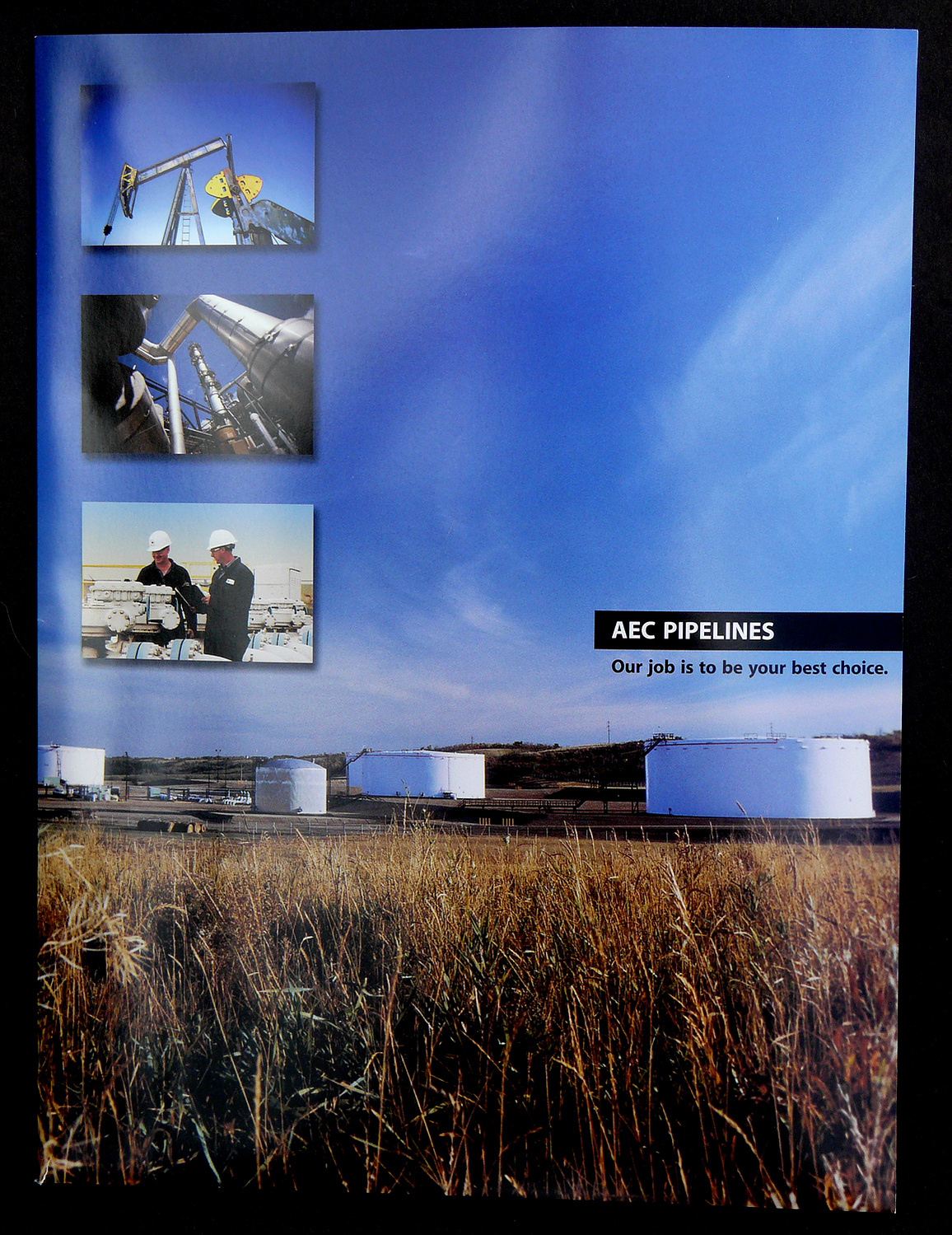
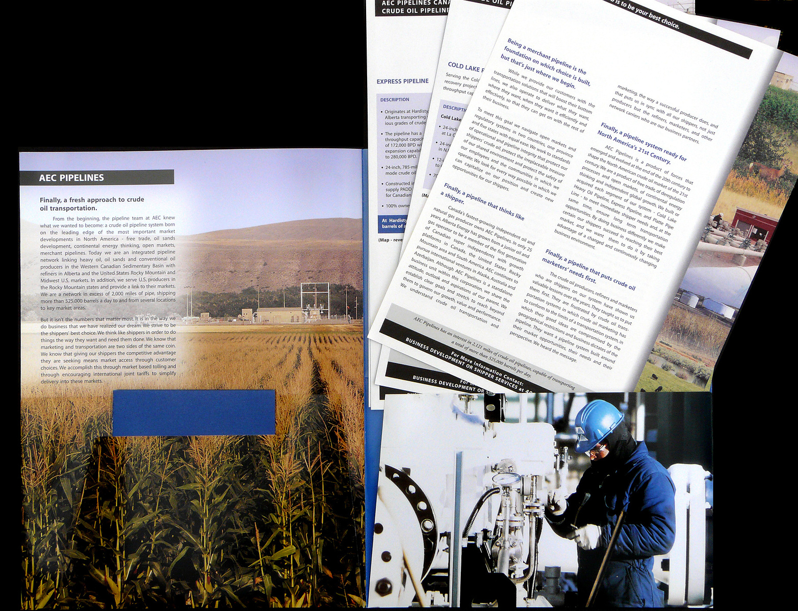
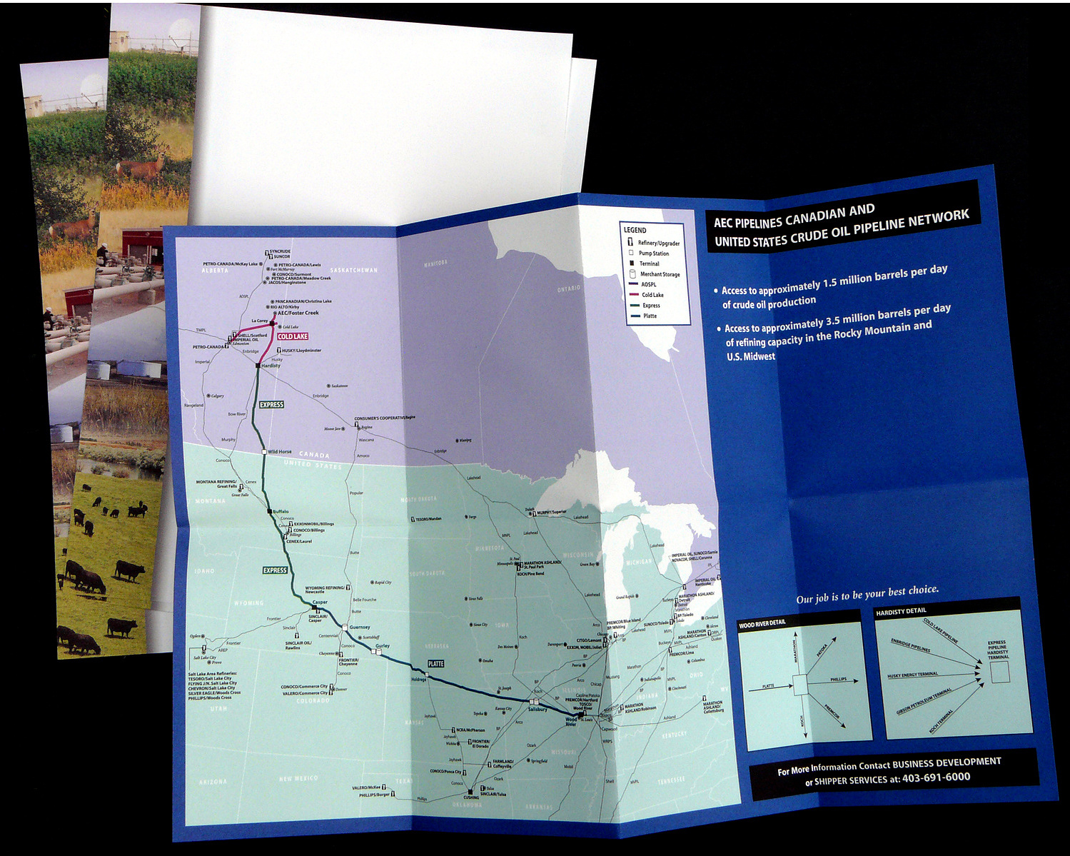
Client: AEC Pipelines
2001
Marketing folder with inserts and fold-out map to provide information regarding the pipeline route.
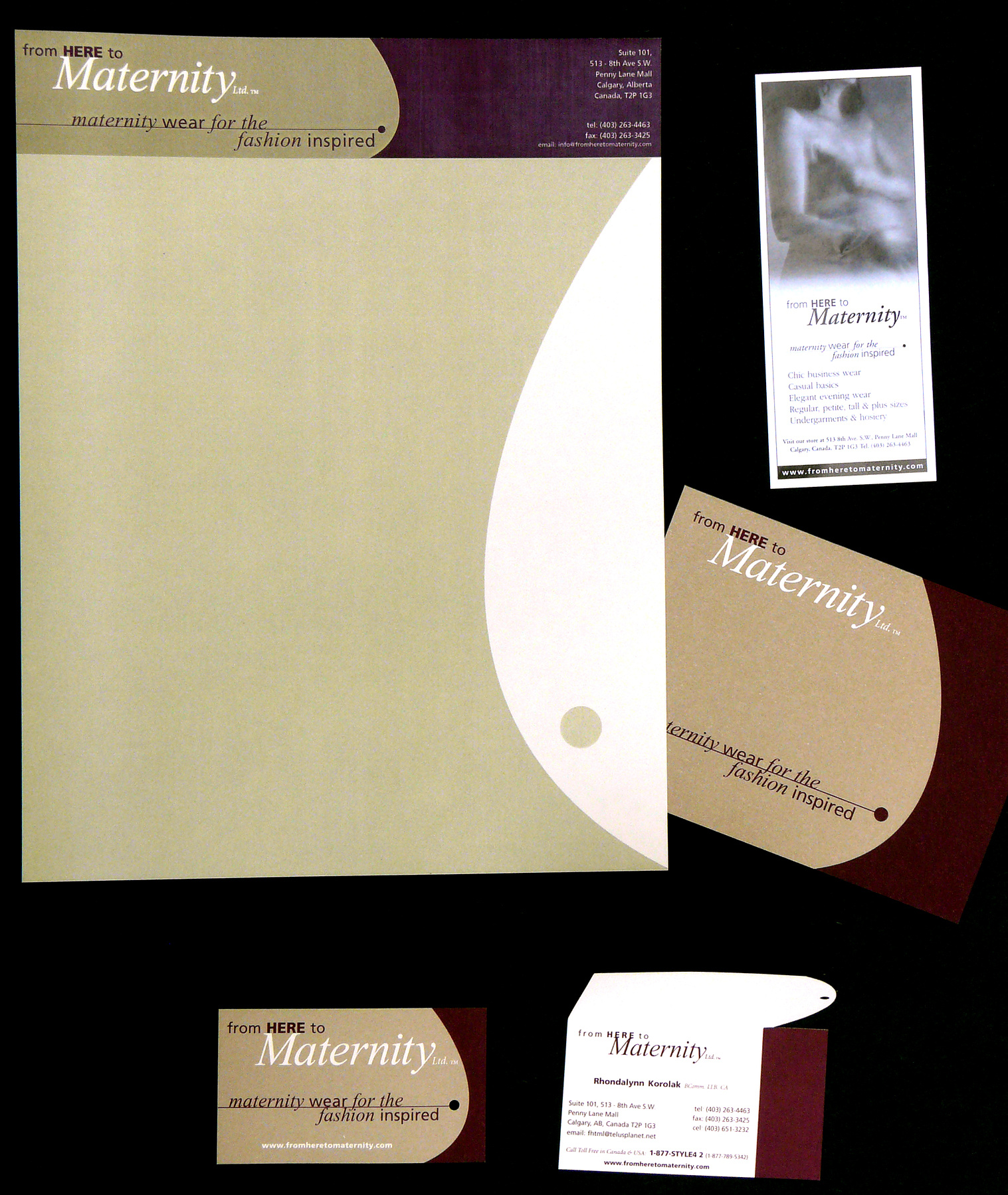
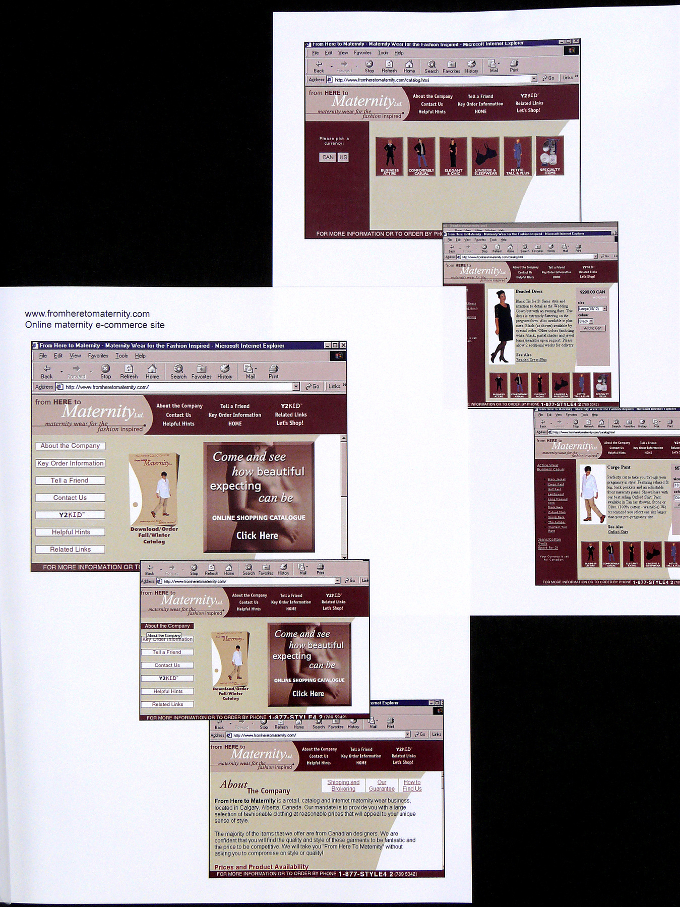
Client: From Here to Maternity
2003
My client needed everything an enterprising entrepreneur needs. We created her brand, print materials and website design.